
The Visual Identity of a Book
- Jul 28, 2025
- 5 min read
Updated: Aug 4, 2025
Reading begins with the cover and the market power of design
There are many factors that influence our book purchases, and these vary from person to person. Of course, we may want to buy a particular book or read more works by a favourite author. However, the reasons behind our purchases are not always so clear-cut. In such cases, the intrigue of the book's title or the associations it evokes may also be important factors. In my opinion, there is another factor that is even more important than these: the design of the book cover. It draws us in psychologically, yet it is often overlooked or not considered worth mentioning.
Last year, I wrote an article that addressed this topic in general terms. If you are interested in the subject, you can quickly read it. In this article, I will focus directly on book covers.
Like anyone else, I am passionate about books, and bookshops are places where I feel most at peace. Like many others, I dream of opening my own bookshop, but for now, we can only shop in them. Perhaps we should have become librarians.
As well as reading for pleasure, I often need to do a lot of research on books. This is particularly true when you run a book club. Browsing bookshops and quickly searching online always feels like a game to me. But, to be honest, contrary to popular belief, it's quite exhausting. When it comes to a reading group, you have to make selections based on certain criteria. The book covers are not usually the priority here. Therefore, I focus on selecting books that will provide material for discussion at the event.
However, when acting individually, we can break free from all of the above. This time, the situation takes a completely arbitrary turn.

At this stage, factors such as price, page count, author, book title, whether it was recommended by a friend, where it was purchased and reviews and ratings all become irrelevant. They are almost all nothing more than confusing parameters. Of course, if you know exactly what you want to buy, that's a different matter.
Imagine you are in a second-hand or new bookshop. You are determined to buy a book. You have no idea what type of book to read. There is no particular series or theme that interests you. How will you make your choice?
First impressions tell us everything and create an instinctive bias, and this is also true of objects. Moreover, when it comes to books, with which we are more likely to form an emotional connection than with other functional objects, this idea makes a lot of sense.
Let's think about children. The stories in children's books tend to be similar. Either they are fables in which animals talk and impart simple moral lessons, or they are colourful, glossy pages designed to delight young children. But that is precisely the point.
Children are “fooled” by this. Actually, it's not really a matter of being fooled. It's perfectly understandable that they would choose the most visually appealing book. After all, these books are designed with their tastes and preferences in mind. Moreover, this genre is evolving with the production of interactive books that children can read as if they were playing a game — or at least to pass the time.
In a way, we are all children at heart. Although we know we should prioritise reading and understanding books, we are always drawn to their appearance first.
Interestingly, I think these designs can also reveal something about our personalities. I won't go into detail, but I'm sure you'll think of something.
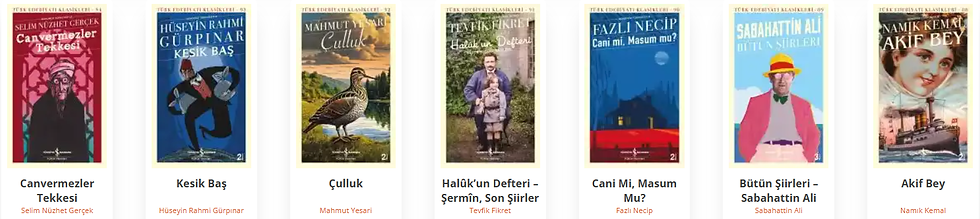
Let's start with a simple structure. We're all familiar with “Türkiye İş Bankası Kültür Yayınları”. You may have seen the books in the “Hasan Âli Yücel Classics” series and perhaps you have read some of them. Fortunately it is a large collection of important foreign works that have been translated into Turkish.

In general, it contains a variety of philosophical, psychological and other scientific works dating back to ancient Greece, as well as classic novels from world literature. Perhaps for this very reason, these classic works are presented in the simplest possible design and colours. This is because the focus is on the quality of the content rather than the design. Honestly, I don't think people who want to read such works will pay attention to the design of the book.
Conversely, the “Modern Classics Series” and the “Turkish Literature Classics” feature colourful and beautiful illustrations that resemble true works of art from various historical periods, such as oil paintings. We can't say that these won't appeal to readers.
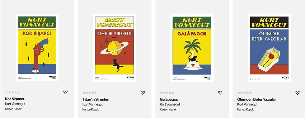
Another example is “İthaki Yayınları”, which, as you know, dominates the science fiction genre today, particularly through its “Science Fiction Classics” series.
Here, the design takes centre stage, combining the genre's appeal. İthaki Yayınları has successfully created and sustained a design concept for years, achieving impressive sales figures. Each book has a single-colour cover featuring an illustration that the publisher believes best represents the narrative. Although the approach is relatively minimalist, the colour tones are far from ordinary and many of the illustrations are more effective and stylish than one might expect.

Yes, even the colours of books can influence our decision to buy them. However, a series' appeal becomes clearer the more books there are in it. We are greeted by an explosion of colours that evokes a psychological response and motivates us to start a collection. In my opinion, one of the intended emotions (perhaps the primary one) is precisely this. Indeed, it worked for me. As well as taking pleasure in owning and reading the works of great authors, I was also quite pleased with the harmonious designs.

An example from the “Science Fiction Classics” series published by “İthaki Yayınları” which I have in my library.
Such designs can sometimes be applied on an author-by-author basis. The most appropriate time for this is when the publishing rights to many of an author's popular books have been purchased or the copyright on their books has expired. The recent availability of Sait Faik Abasıyanık's books nowadays is the best example of this. (I believe “Kapra Yayıncılık” and “Karbon Kitaplar” reprinted them in 2025, and “İthaki Yayınları” also entered the market)
When discussing public domain works, it is worth noting that these are generally classics that have already been published by most publishers. So, what makes them particularly worth purchasing from that publisher? Yes, we know the answer.
There are many more examples. Publishers adopt different designs to promote themselves and boost sales. Sometimes, however, these designs prove less effective than expected and are unpopular with readers.
Doesn't the content remain the same, regardless of how “awful” the book cover looks? So why do we prefer to purchase the same work from a different publisher? Whether we admit it or not, book covers that encapsulate the narrative, stand out with their style, evoke a unique atmosphere and exude a signature quality will achieve higher sales figures more easily.


Comments